What is Responsive Web Design?
I can hardly do better than a current Wikipedia definition:
Responsive web design (RWD) is a web design approach aimed at crafting sites to provide an optimal viewing experience—easy reading and navigation with a minimum of resizing, panning, and scrolling—across a wide range of devices (from mobile phones to desktop computer monitors).
See “An Example” below to get a live example and tip for seeing the results of responsive web design in action.
Why Does it Matter?
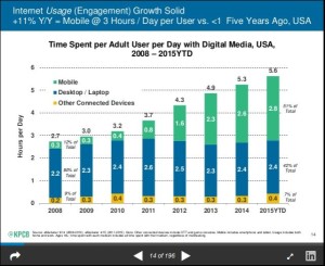 If you routinely use a smaller hand-held device (tablet or smartphone) to browse the web, you will appreciate the effort I and other web designers are making to give you an excellent experience. Non-responsive sites are simply a pain to look at on small devices. Pinching and expanding to make text readable and to make the navigation and images viewable is off-putting, to say the least. This wouldn’t matter if it were only a rare experience, but that’s not the case. Here is an astonishing fact (from Kleiner Perkins Caufield & Byers):
In the USA, MOBILE BROWSING now accounts for over 50% of time that adults spend on the Internet.
An Example
CLICK HERE to view the actual website.
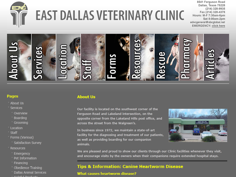
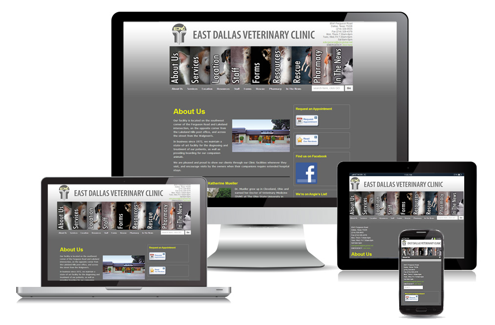
Here is an example of a responsive site that I recently updated for East Dallas Veterinary Clinic. The practice manager at EDVC was keen on having a site that could be easily navigated on an iPhone. We were careful to keep the most important information (e.g., phone number and driving directions) right at the top of the screen for small devices. If you click on the link in the caption of the accompanying graphic, you will be taken to the EDVC website. TIP: If you are on a desktop computer, grab the lower right corner of your browser window and squeeze the window in to the left. As you do so, you will see graphics adjusting their size and positioning–very much like they would adjust when being opened on smaller devices.
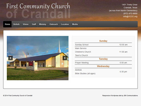
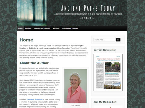
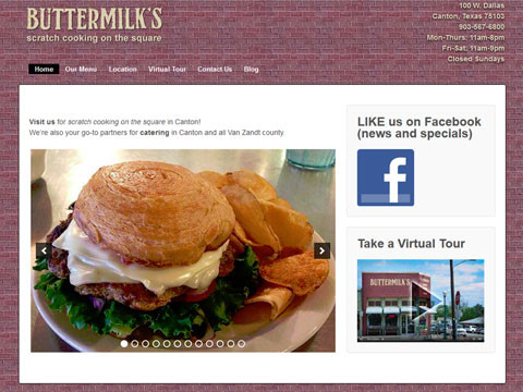
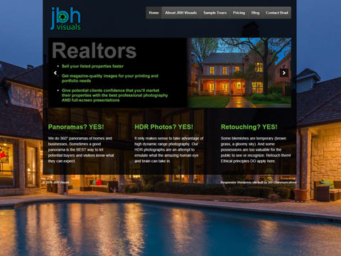
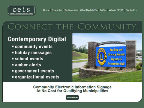
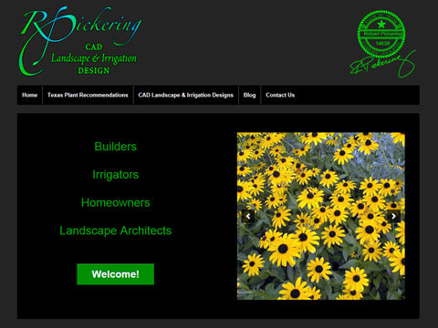
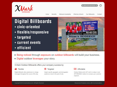
In the slideshow below are examples of other sites I have recently built or upgraded to be responsive. You can click on any of the images to be taken to the actual, live site.
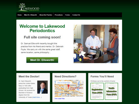
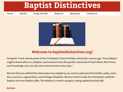
JBH Sites Built or Updated with Responsive Design